Forecasting Sales Using Prophet
Welcome to another post about my Data Analytics journey. As you all know businesses rely heavily on accurate forecasting to make informed decisions and plan for the future. Time series forecasting, in particular, provides valuable insights into trends and patterns, making it a crucial tool for various industries.
In this blog post, I’ll explore the process of forecasting sales using a python library called ‘Prophet‘. Prophet was developed by Meta’s Core Data Science team, and is still a powerful tool today. I’ll walk you through each step of the predicting process, from data preparation to model evaluation, offering practical insights and tips along the way.
Introduction: e-commerce data
Sales forecasting is an essential task for businesses across all sectors. Whether you’re a retail giant or a small-scale e-commerce store, understanding future sales trends can help:
– optimize inventory mgt
– plan marketing campaigns
– allocate resources effectively.
The data I’m using in this project is a sample of the sales from an e-commerce webshop. Sales were recorded over a 2 year period.
Getting Started
Understanding the dataset
The first steps in understanding a dataset is to do some exploratory analysis. We want to know how large the file is, how many columns we’ve got, the min & max values for each datetime- and numerical column, and some statistical information.
In my case, I’ll be analyzing sales data, which typically includes information such as product names, quantities sold, and timestamps of transactions.
Check data quality
This step involves a number of action like:
– check each column for missing values
– check the set for outliers (for example: a-typical sales qty’s or prices)
In most cases some information needs to be removed or re-engineered to make the data suitable for further processing. Empty values or null values can cause the model to be less accurate in its predictions.
Ideally most points fall within the blue box, or within the whiskers (the 2 vertical black lines). But as you can see there are quite a number of individual black data points that can be considered outliers. Let me explain the plot in a bit more detail:
- Box: The box represents the interquartile range (IQR), which spans from the 25th percentile (Q1) to the 75th percentile (Q3) of the data distribution. The length of the box indicates the spread of the middle 50% of the data. The line inside the box represents the median (50th percentile) of the data.
- Whiskers: The whiskers extend from the edges of the box to the furthest data points within 1.5 times the IQR from the quartiles. Any data points beyond the whiskers are considered outliers and are plotted individually as points.
- Outliers: The individual data points that fall outside the whiskers are plotted as individual points. These points represent values that are significantly different from the rest of the data and may need further investigation.
For the objective of this project I had no need to investigate the anomalies in the Discount column. I just used it as an example of what you can find when investigating a dataset.
Data Filtering
In order to create a prediction model I experimented using just one product from the entire dataset. So I filtered the data and then made a split in order to prepare it for the Prophet model
Filtering steps I took in this e-commerce dataset were:
1. Identifying the Most Popular Product
To demonstrate the forecasting process, I began by identifying the most popular product in the sales dataset. This involves analyzing the total quantity of each product sold over the entire time period (3 years. Result was one product (code: Go-Wo-NMDVGP) sold on 905 days.
2. Check its sales over time (3-year period)
As you can see sales seem to have a pretty regular pattern (but is that the whole story…?)
Building the Forecasting Model
My goal is to make forecasts to see what sales we can expect in the coming weeks or year. We have the historical data and need to feed it into a Prophet model. Steps I took are:
1. Split the Data
Having the target product, I split the sales data into training and testing sets. The training set will be used to train the Prophet model, while the testing set will be used to evaluate its performance.
2. Create the Prophet Model
With the data prepared, I created a Prophet model and fit it to the training data. Prophet’s intuitive interface allows to specify various parameters, such as seasonality and holidays, to customize the forecasting model according to our dataset.
I created this piece of python code to create the model:
This tells the model that I wanted to include seasonality on a weekly basis, and disregard any holidays.
Generating Forecasts
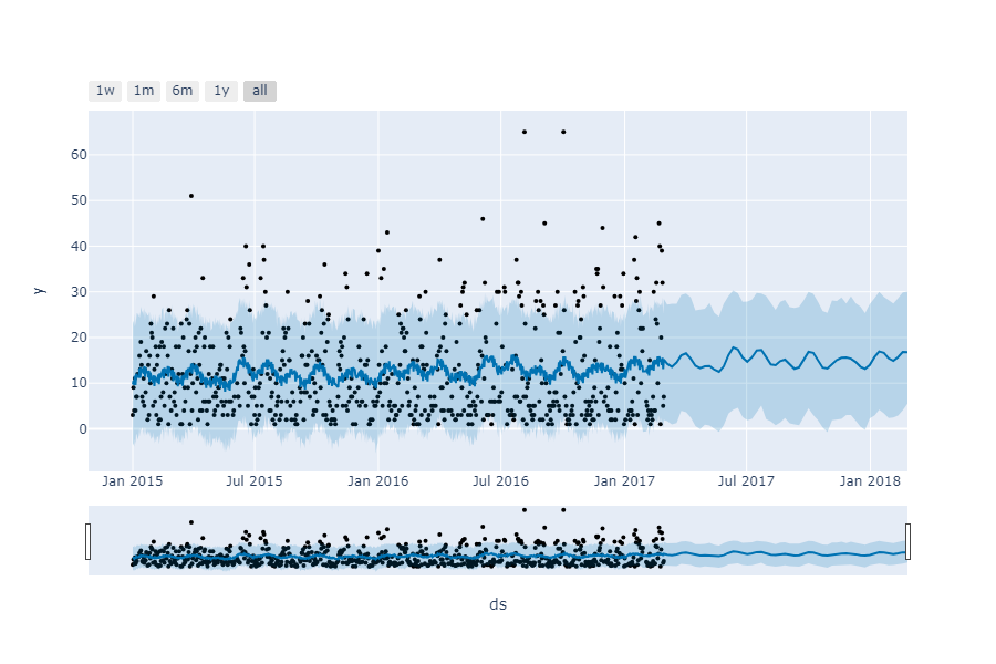
With the trained Prophet model, I can now generate forecasts for future time periods.
In my example, I have predicted sales for the next 52 weeks, thus providing valuable insights into long-term trends and potential fluctuations.
The plot shows all weekly data points, a (rising) trend line and a forecast line (with confidence interval).
Interestingly there are some points outside the confidence intervals indicating the wideness of the spread (variance) of sales over the weeks. Orders for over 30 items are non-typical, but they show up from time to time. It is important to further zoom to these occurances.
Plotting 3 trend components
To visualize the individual components of the trends and patterns, I have a created a 3-chart plot. This forecast plot depicts the long term trend, the expected yearly trend and the weekly trend.
The plot shows 3 components:
- Trend Component: It shows the overall trend in the data. It helps visualize the long-term behavior of the time series data, allowing you to identify patterns and trends.
- Seasonality Component: The second plot is the seasonality component of the forecast. In my case it illustrates the weekly seasonality. By examining this plot, you can identify seasonal fluctuations and understand how they contribute to the overall pattern of the time series.
- Weeky Component: The plot on the bottom depicts the weekly sales or ordering pattern of this product. Monday’s and Saturday’s don’t seem to be very popular

Changepoints in the trend
The Prophet tool is good at indicating clear changepoints in trend, but in our case the trendline is steadily moving up, and does not show major breaks in the trend.
In red the main trend line.
Evaluating Performance
To assess the accuracy of the forecast, I have calculated performance metrics such as Root Mean Squared Error (RMSE) and Mean Absolute Error (MAE). These metrics quantify the difference between the predicted and actual values, providing a measure of the model’s predictive power. In my case having a wide spread in demand from 1 to sometimes over 50, resulted in an overall 3 year MAE of 9.
Conclusion
In this blog post, I have explored the process of forecasting sales using Prophet. I have given insights in its capabilities by showing graphs of how forecasts depict trend and seasonal fluctuation. This is information that can be hidden under the service of any business that is involved in sales or logistics.
By following the steps outlined above, businesses can leverage the power of time series analysis to make data-driven decisions and gain a competitive edge in today’s markets.
I believe that every data scientist or business owner should look at this as an opportunity to optimize his or her daily operations, thus driving growth and profit.
The entire code
Check out all of the code of this project at Github: Nick Analytics – Demand Prediction with Prophet


