Credit Card Fraud Detection
Welcome to this new post about my Data Analytics journey.
Credit card fraud is a huge challenge in the digital age, with cybercriminals employing increasingly sophisticated tactics to exploit vulnerabilities in the system. However, armed with knowledge, awareness, and proactive measures, we can strengthen ourselves against the threat of fraudulent activities.
I came across a very nice challenge posted by American Express. This company provided a huge (50GB) set of data representing regular transactions along with fraudulent ones. Some files contained more than 10 million rows making it hard for even a strong computer to open them. Let alone processing the information and creating a prediction model. On top of that the data was completely anonymized, making it impossible to understand what each column meant.
I took the challenge, reduced the files, investigated several prediction models, and came up with a good working one. Let’s start this blog with my first step, how to turn huge files into ‘manageable’ ones.
The dataset
I had these three files
– a training set of 5 million transactions (16GB)
– a test set of 11 million transactions (33GB)
– each set has 190 columns of anonimyzed data
The largest dataset has 11 million rows and 190 columns. Those add up to over 2 billion data points ![]()
A training set contains information meant to train a machine learning model. Apart from all the data about the transactions, it also hold a column that indicates if the transaction was fraudulent or normal. We call this the ‘target’ column.
The test set is used to make predictions about the type of transaction (fraudulent or normal)
The columns or column titles don’t reveal anything about the transactions. They come with names like ‘S_2’, ‘P_2’, ‘D_39’, ‘B_1’, ‘B_2’, ‘R_1’. And values between 0 and 1.
Reducing the file sizes
With my computer it was no possible to work with these large sizes.
What I did was using a special Python library called ‘Dask‘ to do the heavy work for me. Dask can read a file without actually loading it into your memory. So I read the file and then chopped it up into much smaller chunks. I saved them in the ‘feather’ format and then reloaded and saving them into a parquet file. I then recombined the files and ended up with sizes that had been reduced to 10% of its original size.
Inspecting the data with Sweetviz
I used a Python library called Sweetviz to conduct an initial investigation on the data. Sweetviz can provide very important information on the dataset with respect to:
- Associations of the target variable (fraud or not) against all other features
- Indication which column are categorical and which ones numerical or dates
- The amount of missing data in each column
- Target analysis, Comparison, Feature analysis, Correlation
- Numerical analysis (min/max/range, quartiles, mean, mode, standard deviation, sum etc.
My first analysis of a subset of the training data (5000 records) yielded the following results:
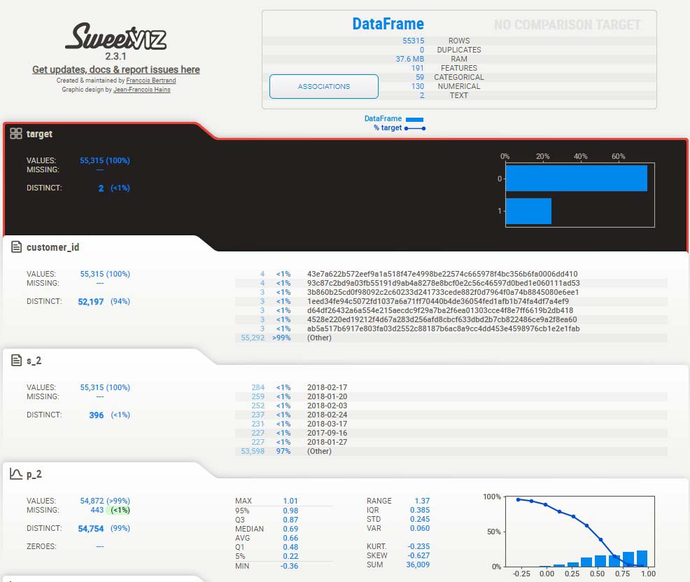
The image above depicts the most important column (our target column, in black) along with all other 190 columns below it (you see only two of them). In the top section you can see the number of rows, duplicates, feature types (categorical/numerical or text).
A closer look
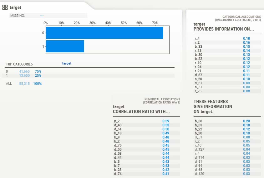
If we zoom in further on the target column and its associations we find the following data:
This part shows us that 75% of the transactions are ‘normal’, and 25% are fraudulent.
Along with the plot there are 3 tables that display how closely related the target column is with the numerical columns and categorical columns. I am most interested in:
– the Correlation Ratio (table at the bottom left) because if there’s a strong correlation between target and numerical feature we could say that the feature influences the outcome, and thus would be of interest in our prediction model.
– the Association Ratio (table at the top right) for the same reason as the correlation ratio, only in this case we’re dealing with categorical features.
So, if we want to reduce dimensionality in our dataset we could decide to only involve high scoring ratio’s and leave out the low scoring ones.
Dimensionality reduced
The exercise above has lead to a reduction of 153 columns to 39. This step is very important to keep the dataset ‘manageable’ and suitable for machine learning. Too much complexity required extreme calculation power and in general poorer results.
Dealing with missing data
Machine Learning models require information to be complete. If this is not the case (like in our example), we need to decide how to solve this problem. There are 3 ways:
– If a lot of information is missing in a column, we can remove the column
– If only some fields are empty we can fill them with the average for the column
– If key columns miss data we can make a prediction model just for this purpose
Note I used Pycaret for further analysis. This package deals with missing values automatically by imputing its values.
Selecting a Machine Learning model with PyCaret
PyCaret is a really nice Python library if you want quickly get insights which machine learning models may work best on your data, together with nice plots to back it up.
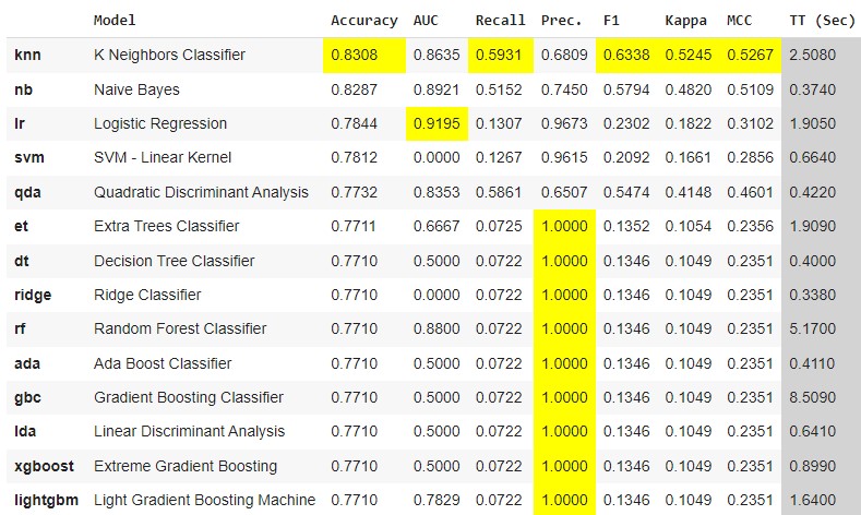
In this step I loaded my (reduced) dataset and set it up in PyCaret. I then put PyCaret to work telling it I wanted to get the best perfoming model. Here’s what happened:
The plot shows a list of ML models that have been tested (first two columns) with the results of each one of them in next columns. How do we interpret the most important indicators:
- Accuracy: overall correctness of the model.
- AUC: ‘Area Under the Curve’. How well does the model classify the positives and negatives.
- Recall: the proportion of actual positives correctly identified by the model
- Precision: True positive predictions among all positive predictions. In simple terms, the model could have predicted all normal transactions as normal, but may have overlooked many fraudulent ones. So, a score of 1 (perfect) only tells us something about positive (normal) predictions.
- F1: (harmonic) mean of precision and recall. It is useful when you want to consider both false positives and false negatives.
For me the most important indicator is the one that is best at predicting true fraudulent transactions and as few as possible false positives. We don’t want to bother customer with legal transactions and tell them it’s a fraud.
I went on with Naive Bayes as it has a high accuracy and a better precision than KNN.
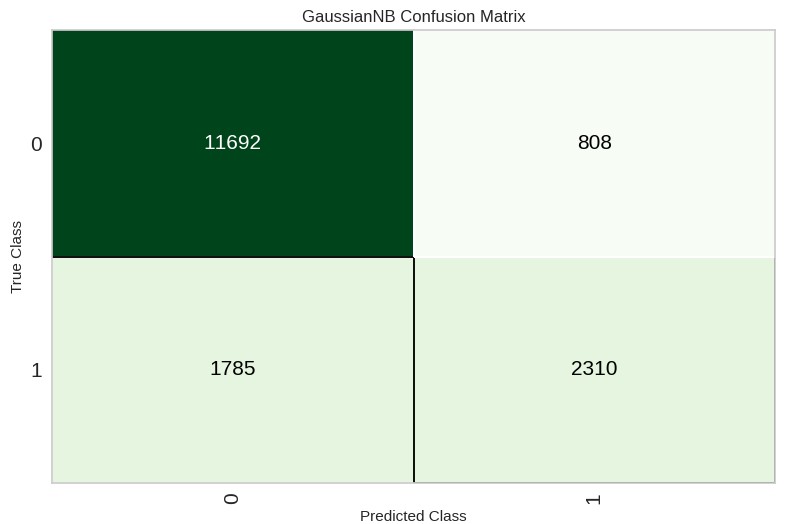
Here below I displayed the Confusion Matrix and UAC plot of this model:
On the trainset it predicted 11692 correctly as ‘normal’ transactions and 2310 correctly as ‘fraudulent’. 808 were predicted as ‘normal’, but were fraudulent, and 1785 were predicted as fraudulent, but were normal.
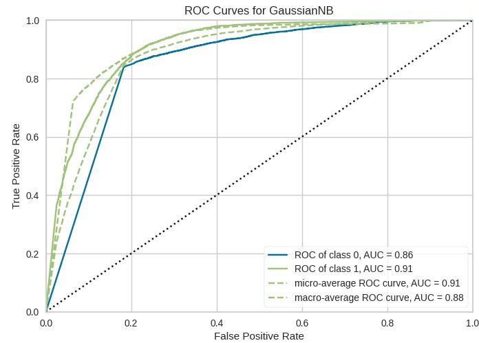
A higher AUC indicates better model performance in terms of classification.
Actual Predictions
I used the model and created predictions on data the model never saw before (called a test set). The nice thing is that we not only get a prediction (0 or 1), but also a prediction_score (how confident is the model). It looks something like this:

Note: I just displayed the last 3 columns of all 39 columns.
Conclusion
In this blog post, I have explored the steps of analyzing a large dataset with fraudulent credit card transactions. I have given insights by showing graphs of the way data correlated and can be reduced to leave only relevant features. With PyCaret I tested and selected a Machine Learning model for predictions. I evaluated how accurate the predictions will be by explaining the classifiers that belong to this model.
My analytics work may be valuable in the financial world where the battle against fraud is taking more and more time and manpower.
The entire code
Check out all of the code of this project at Github (sweetviz part): Nick Analytics – Credit Card Fraud pt. 1
and on Google Colab (the PyCaret part): Nick Analytics – Credit Card Fraud pt. 2


