Predicting Finish Times in an online Dashboard
Welcome to this new post about my Data Analytics journey.
In a previous blog post I have done a Statistical Analysis and Comparison of the Boston Marathon, edition 2022 and 2023. In my new blog post I want to dive deeper and see if there is a way to predict finish times of runners participating in the Boston Marathon. The idea is to take the times recorded at the checkpoints (at 5k, 10k etc) and take these as input to a model that can predict the finish time. How cool would that be !
During this venture I was pretty overwhelmed with all the data and complexity I had to deal with. Should I build one model, multiple models, models for males and females, for fast and slow runners, for each check point? I had to think it over and in the end came up with a good working solution.
The work I did in this project roughly consisted of two main parts:
1. Creating a good working finish time prediction model
2. Building a website with a dashboard to showcase the model and see some statistics.
So, if you are interested in running, and in predicting finish times, buckle up for a great read.
The dataset (year = 2023)
In my previous blog I described that I collected the data from the official Boston Marathon website. In 2023 there were some 26.000 runners of which I could use the following properties:
– Bib number – the unique identification runners wear on their shirt
– Age of the runner
– Gender of the runner
– Passing times at 5k, 10k, 15k, 20k, Half way, 25k, 30k, 35k, 40k, Finish
The environment I used to process the data and create the model (with the dashboard) was VS Code with the Python coding language.
Creating the Machine Learning model
Diagram
In the diagram below I visualized the steps I took to create the Machine Learning prediction model.
My most important challenge was how to perceive the data. Is this a time series problem were the intermediate passing points are sequential timestamps in hours, minutes and seconds, or should I convert the timestamps to a numeric value that represents a certain duration. I decided to go for the last option because Machine Learning Models that work with time series can’t have a time series as the timeline and have the target variable (predicted value) as a datetime value as well.
So, I took the timestamps for all runners at each checking point and for mathmetical reasons converted this information from a hh-mm-ss value to a numeric value that expresses the time in minutes with decimals. Example: 1 hour, 20 minutes and 30 seconds became a value of 80,50 minutes.
So, in the end my steps to generate the model looked something like this:
Overview of the modelling steps.
Let me explain a bit better what feature engineering means and also the train, test steps of Machine Learning Model creation.
Extra features
During the pre-processing phase I added a bunch of new columns to the data, to see if it would improve my prediction process:
Features (columns) that I added to the data were:
– Average Pace between each checkpoint
– Percentage decay between each checkpoint
– Mean pace at each checkpoint
– Average Standard Deviation at each checkpoint
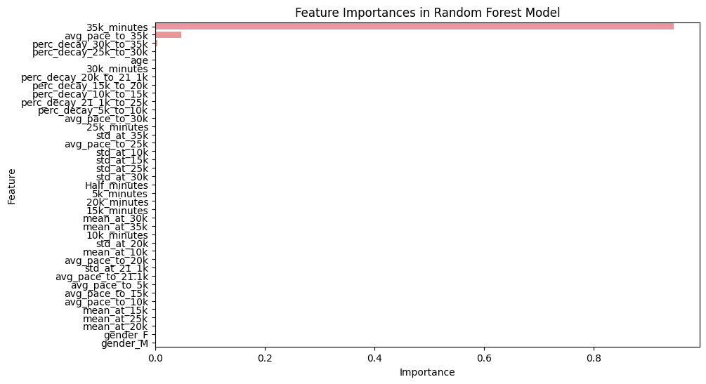
My idea was to generate as much relevant data as I could and then put it all in a Machine Learning cycle to see which features a truly predictive. The outcome was kinda surprising as you can see in the plot just below.
This plot was a check on what features would be most predictive of the runner’s finish times at the 35k check point. Basically the only things that seem to count are the current passing time, the average pace to 35k and the decay from 30k to 35k. Age and gender don’t seem to matter once you’re on the run ![]()
Deciding on the best model
The best model is the one that makes the best predictions overall. In ML terms we can also say that it is the model with the lowest error. I’ve tested a couple of ML models that come out of the box (like Random Forest and Linear Regression), and decided to go for Linear Regression (LR).
Along the way I found out that one size fits all is not the best approach, so I created different LR models for each checkpoint (so one for the point where the 5k results come in, one for the 10k results etc). I ended up with 9 models.
An example on how well the model does is depicted here below. This bit of code result is taken at the 10k passing point. It indicates that the MAE (Mean Absolute Error) is 7.15 minutes for all runners, so a bandwith of 3,5 minutes to the upside or downside.
I measured the error (deviation) at other passing point as well, and this resulted in the plot here below:
Performance of the prediction model.
As you can see the performance of the model(s) improved significantly the closer we got to the finish line. This makes sense of course, but it is nice to see it back like this. After 30k the model is only 2 minutes off on average with only a handful of parameters. Truly remarkable !
Constructing the Dashboard
I uses a Python library called Streamlit to showcase my work on a webpage. Streamlit is a really nice tool to quicky create web applications for machine learning and data science projects. It allows you to write Python scripts and turn them into interactive, visually appealing web apps.
ML driven online finish time predictor
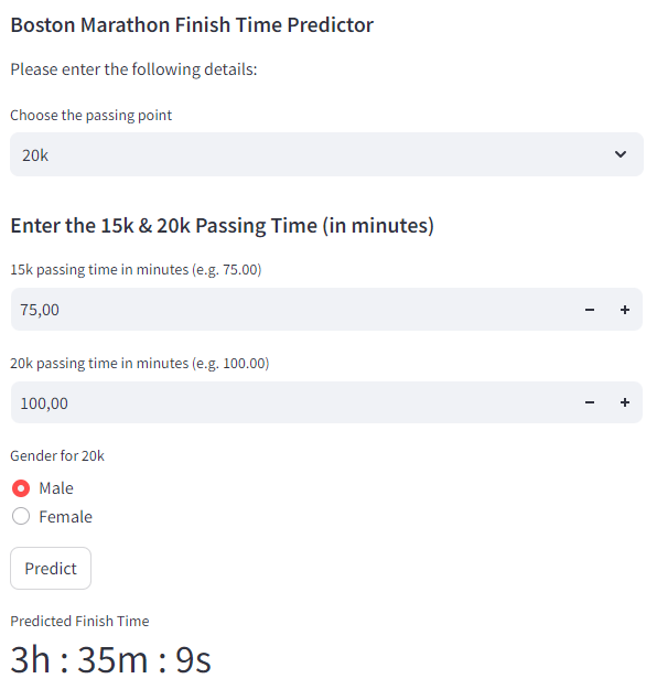
I created a simple tile on the dashboard where you can predict your finish time based on the time at the checkpoint at 5k, 20k and 35k. I added gender as well because males are expected to be faster than females. The result looks like the image below:
The finish time predictor on my dashboard
Future application of the model
The predictor I created is a great step in marathon finish time prediction. But of course we want to take it to a point where runners get their predicted times straight on their phone app or smartwatch during the run. As I don’t have the real time data or a large inferencing server I cannot make that happen. But understanding the variables that are in play and taking those to creating a well working Machine Learning model are crucial steps.
Another extension could be to create more models tailored to age and gender, combined with the checkpoint time. Lastly it would be great to distinguish professional runners from amateurs and to have an end time indication of each runner before the start. That could be something they fill in on their application.
So, many improvements are possible, but for now I’m happy with the progress I made.
Other elements on my dashboard
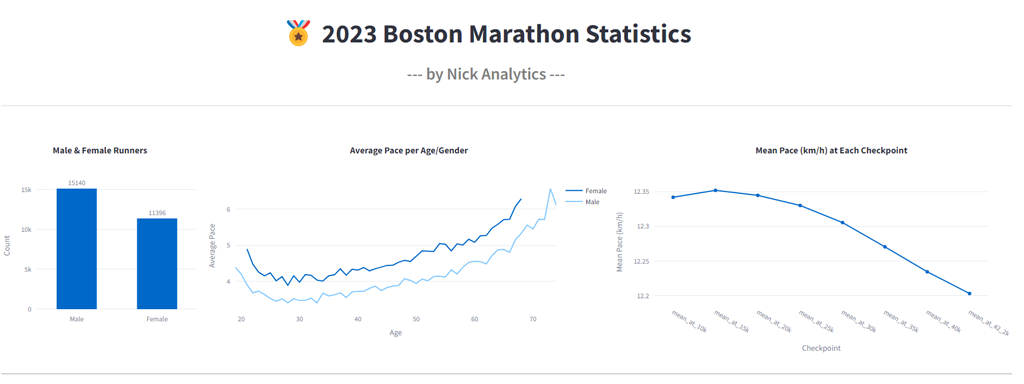
I added some other tiles on my dashboard with statistical facts like average pace, number of males/females and others.
A previous is displayed here:
A glimpse of other elements on my marathon dashboard.
Check out my dashboard
My dashboard can be found on this link: Nick Analytics Dashboard or press the button:
Conclusion
In this blog post, I’ve described the steps I took to create a Machine Learning model that can predict finish times during the Boston Marathon. It was important to choose the right parameters to train the model. After some iterations I concluded that the most predictive features were the current passing time, the average pace to 35k and the decay from 30k to 35k. Age and gender don’t seem to matter that much once you’re actually running.
The models I created become more accurate as runners get closer to the finish line. At the first checkpoint the mean absolute error is 8 minutes (so, plus or minus 4 minutes). After 30k this deviation drops to below 2 minutes (plus or minus 1 minute). Note that these times apply to all runners participating. Creating additional models for example for professional runners or males/females could reduce the error even more.
Thanks for reading my blog. Nick.
The coding I’ve done (in VS Code)
Check out the code of this project on Github: Nick Analytics – Predict Finish Times

