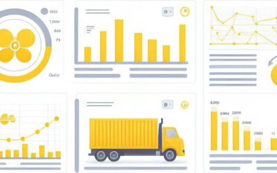
+31 (0)6 319 42 640 nick@nickanalytics.com
Select Page

My Power BI Dashboard

Welcome to this new post about my Data Analytics journey.

When I studied Data Science at Datacamp, one of the exam assignments was to create a Power BI Dashboard. The Dashboard should give clear insights in the Logistics and Sales of a company called Pens & Printers. This national office supplies chain experienced  significant sales discrepancies across their four regional warehouses—East, West, South, and Central. I knew I had a challenge on my hands…

The company was struggling with large amounts of unsold stock and needed to identify underperforming products and uncover regional sales patterns to optimize inventory and boost overall profitability.

I created a very nice Power BI Dashboard with multiple tabs to showcase my skills, and to provide upper management with an analysis and building blocks to adjust its strategy.

Link to my Dashboard: Nick Analytics Power BI Dashboard


Analysis & Recommendations

During my analysis I defined 3 business goals that should serve as a foundation for change. 

1. Minimizing Unsold Stock

My primary goal was to ensure that no stock was older than 3 months. The findings were alarming: numerous items had remained unsold beyond this period.

My Recommendations:

  • Stop stocking high-risk, high-value items like Copier Machines and Tables.
  • Initiate a 20% discount sale on unsold items to free up warehouse space and capital.
  • Fulfill orders from a shared inventory pool across all warehouses to balance stock levels.


2. Balancing Sales Across Regions

Another crucial goal was to ensure sales across all locations were well-balanced, with a maximum of 10% difference between region/subcategory combinations. The data revealed that the West region significantly outperformed the South in all subcategories.

My Recommendations:

  • Close the South warehouse and redistribute its inventory to other regions to achieve a better balance.


3. Maintaining a Healthy Profit Margin

The final goal was to maintain a gross profit margin of 25%. However, the current gross profit margin was only 10%.

Recommendations:

  • Restrict discounts to manage profit margins more effectively.
  • Implement a maximum 20% discount only when upselling (e.g., buy 2, get 1 at 20% off).
  • Consider discontinuing Tables or the entire Furniture category from the catalog.

Data Visualization: The Road to Insights


1. Identifying Unsold Stock

Using Power BI, I visualized the recency of sales across regions. This visualization highlighted products that had not been sold within the last 90 days, revealing the extent of unsold inventory in each warehouse.

unsold items

Key Insight: The South region had the highest unsold stock value, indicating significant inefficiencies in inventory management.


2. Sales Performance by Region and Category

Next, I examined total sales and profit margins across the regions. By plotting sales data over four years (2014-2017), I identified trends and disparities in performance.

sales

Key Insight: The West region consistently outperformed other regions in sales, while the South lagged behind. This confirmed the need for redistributing inventory.

3. Profit Margin Analysis

To address the low profit margins, I analyzed the impact of discounts on profitability. A table of discounts versus profit margins across different categories provided clarity.

discount drilldown

Key Insight: Excessive discounts were eroding profit margins, especially in high-ticket items like Furniture and Technology. This supported my recommendation to restrict discounts and manage them more strategically.

4. Product and Sub-Category Performance

I created detailed bar charts to display sales performance across various sub-categories. This helped pinpoint underperforming products.

sales performance

Key Insight: The South is lagging in all categories

5. Reordering Frequency and Stock Management

I analyzed the reordering frequency of products across different categories to identify inefficiencies in stock management. By examining which products required frequent reordering, I could pinpoint areas where stock management could be optimized.

reordering

Key Insight: The Office Supply category, particularly products like Binders and Papers, showed the highest reordering frequency, indicating a strong and consistent demand. Conversely, Technology items such as Copiers and Machines had the lowest reordering rates, suggesting overstocking risks. This insight underscores the need for more dynamic inventory management, focusing on maintaining optimal stock levels for high-demand items while reducing excess inventory of low-demand products.

Check out my dashboard

My dashboard can be found on this link: Nick Analytics Power BI Dashboard or press the button:

Conclusion: Data-Driven Decisions for Future Success

By diving deep into sales data and creating powerful visualizations, I was able to identify critical issues affecting the Pens & Printers company. My recommendations, backed by clear insights from Power BI visualizations, provide a roadmap for improving inventory management, balancing regional sales, and enhancing profitability.

Next Steps:

  • Implement a strategic discount policy: Manage unsold stock and improve profit margins by being more selective with discounts.
  • Optimize the distribution network: Close underperforming warehouses (like South) and redistribute inventory.
  • Monitor sales performance: Continuously track sales data across regions to ensure balanced growth.

With these data-driven strategies and actionable insights, this company will be better equipped to streamline operations and achieve their business goals.


Thanks for reading my blog.

Predicting Electricity Consumption and Production

Welcome to another blog post about my data analytics journey! Today, I’m going to delve into the world of predictive energy modeling by using the Enefit Energy dataset from Kaggle. This Kaggle competition was one of the most interesting and challenging I’ve done so far. Goal was to predict energy consumption and production for the country of Estonia. Predictions had to be made on an hourly basis for the next 2 days. Many  variables were available to come up with a good working model. Examples are the weather forecast, installed solar panel capacity, historical consumption and others.

So, if you are ready, let’s explore the powerful world of energy!


Introduction

It is has become increasingly important for energy companies to predict energy consumption and production on any given day. Here are several key reasons:

1. Balancing Supply and Demand: Energy supply must match with demand to make the system reliable and avoid outages. Accurate predictions help manage the generation and supply of energy. For example, during peak demand, additional resources are activated, but in low demand, there is a saving in resources and costs.

2. Integrating Renewable Energy Sources: As more renewable energy sources like wind and solar are integrated into the energy grid, predicting energy production becomes more complex. Accurate forecasting helps in planning the necessary backup from more controllable power sources like natural gas or hydroelectric power.

3. Grid Stability and Reliability: Predicting consumption patterns and production levels are crucial for maintaining grid stability. Sudden changes in energy demand or supply can lead to grid instability and even failures. Predictive analytics help reduce these risks by providing advanced warnings and allowing for proactive adjustments.

4. Operational Efficiency: By predicting when energy usage will be high or low, companies can optimize their operations, reduce waste, and lower costs. This includes more strategic purchasing of fuel and better maintenance scheduling.

5. Economic Planning: For energy companies, being able to forecast energy trends accurately is crucial for economic planning and investment decisions. This includes deciding where and when to build new infrastructure or expand existing capabilities.

6. Market Pricing: Energy pricing can fluctuate based on supply and demand dynamics. Accurate predictions allow companies to optimize their pricing strategies, potentially leading to better profitability or market share.

Overall, the ability to predict energy consumption and production with high accuracy allows companies to respond better to market demands, integrate renewable energy sources more effectively, maintain grid stability, and optimize economic outcomes.


Exploring the Dataset

The dataset consists of several .csv files like electricity & gas prices, clients, weather forecast (3.5 million records), historical weather, regions with weather stations and a training file (over 2 million records).

The forecast weather is an historical file of weather forecasts over the last 1,5 years. It contains 3,5 million records with data of 112 GPS areas, each with 1 prediction per hour, each 1,2,3,4…48 hours ahead. Elements recorded are:

latitude,longitude,origin_datetime,hours_ahead,temperature,dewpoint,cloudcover_high,cloudcover_low,cloudcover_mid,cloudcover_total,10_metre_u_wind_component,10_metre_v_wind_component,data_block_id,forecast_datetime,direct_solar_radiation,surface_solar_radiation_downwards,snowfall,total_precipitation

Historical weather has the same type of information, but holds the actual weather and not the forecast.

Another crucial source of information is the client file. I won’t go into too much detail, but it became very important to categorize customers based on product (contract) type, county, whether the client is a business or not, and the available solar power capacity.

During this exploration phase I did some checks to see if I understood the data correctly and if there are any obvious pitfalls I could detect right from the start.

Sales Price Distribution

Position of the weather stations over Estonia

Relationships between variables

I did some checks to understand the relationship of certain variables to another variable. Noteworthy ones I can mention here are:

  • Energy Capacity over time: The plot I created here shows the growth of energy capacity, related to Product or Contract Type and Business/Household combitions.
    The visual shows a clear capacity growth, specifically for Product Type 1 and 3.


    Product (Contract) Type: 0: “Combined”, 1: “Fixed”, 2: “General service”, 3: “Spot”


    Next relationship I investigated was between the weather components and the variable that I needed to predict (production and consumption).

    • Relevant weather components related to power consumption: In the plots below I show the most relevant attributes of the weather forecast when it comes to energy consumption. It is clear that energy consumption declines when the temperature rises. And we can also conclude that there is a negative correlation between energy consumption and the amount of radiation (sunlight).

    Weather elements that influence energy consumption.


    I also investigated the influence of weather on energy production.


    • Relevant weather components related to power production: In the plots below we see the opposite effect when compared to power consumption. When there is more radiation (sunlight) there is more energy production. This is a possitive correlation. We can also see that most energy is produced between 10 hrs am and 17 hrs pm. That makes sense, but it is nice to see that the data backs up this ‘no brainer’. Another positive correlation is seen at the installed capacity. More capacity means more production. Another ‘no brainer’. Final plot shows the relationship with temperature. Cold temperatures mean less production, and temperatures between 5-15 degrees the highest. After 15 degress there is no further increase.

    Preprocessing of the Data

    Preprocessing of data is a vital step in every Data Science project. Most datasets are far from perfect and need to undergo vital steps for it to serve as input to a Machine Learning Model.

    The steps I took in this Energy dataset were:

    1. Handling Missing Values

    One of the initial challenges in any data science project is dealing with missing values. In my case there weren’t many so I won’t go into that.


    2. Checking for Outliers

    Outliers can significantly impact the performance of predictive models. I utilized the same pairplot techniques (see above) and Z-score analysis to identify and remove outliers from the data. As it turned out only the electricity prices had some significant outliers. These outliers were removed and filled with the same price as a previous meaningful price point.


    3. Encoding Cat. Variables

    Categorical variables need to be encoded into a numerical format before feeding them into machine learning models. I did not have to do any encoding to this data.

    Building the Machine Learning Models

    After completing the pre-processing steps, it is time to create the Machine Learning model. The challenge is to predict energy consumption and production. These two variables can take on pretty much any value, so we consider the predictions to be ‘continuous’ (as opposed to for example predicting a fixed outcome of ‘yes or no’, ‘true or false’ etc.).

    I decided to build different types of ML models for Energy Production and Energy Consumption.


    1. A model that predicts Energy Production

    I evaluated 6 different models, suitable for predicting continous variables. The models are: LightGBM, XGBoost, CatBoost, Random Forest, AdaBoost, Decision Trees.

    The outcome:

    Training and evaluating LightGBM…
    Mean Squared Error: 9846.536495704782
    Mean Absolute Error: 25.022088199724102

    Training and evaluating XGBoost…
    Mean Squared Error: 10593.784468962709
    Mean Absolute Error: 25.470343101038633

    Training and evaluating CatBoost…
    Mean Squared Error: 8252.14802273349
    Mean Absolute Error: 23.15684970360955

    Training and evaluating Random Forest…
    Mean Squared Error: 11256.553856624487
    Mean Absolute Error: 23.881381789537063

    Training and evaluating AdaBoost…
    Mean Squared Error: 78885.39620655986
    Mean Absolute Error: 171.638968077889

    Training and evaluating Decision Trees…
    Mean Squared Error: 20994.16420299445
    Mean Absolute Error: 32.875448153599145

    Model of Choice: CatBoost


    Feature Importance CatBoost

    Understanding which features contribute the most to my CatBoost’s predictions is crucial for making informed decisions. The outcome of such analysis is depicted in the plot below. With this information I can take the most important features and neglect less importance features to improve the model even more.

    This plot displays the most important features (columns). Those are the installed capacity, solar power (radiation), eic_count (count of energy production sources), temperature and several others.


    2. A model that predicts Energy Consumption

    For the Energy Consumption part I went for the Gradient Boosting Model. This model performed best in my tests. 

    Model of Choice: Gradient Boosting Model


    Feature Importance Gradient Boosting

    For Energy Consumption I found that the most important features were: temperature, working day and hour of the day


    I created 69 Gradient Boosting Models  

    For each County / Business-Household & Product or Contract type I created different models, all with the same parameters but trained on different data. This resulted in 69 model, tailored to each possible consumption scenario.


    Making Predictions

    With my code and models, I’ve made predictions on new unseen data generated in the Kaggle competition. I’m excited to see how my model performs against other competitors and contribute to the advancement of predictive modelling in the energy world.

    Stay tuned for updates on my model’s performance and further insights from the competition!


    Key Take Aways

    The predictive energy modeling project using the Enefit Energy dataset provided several key insights:


    1. Accuracy: Accurate predictions of energy consumption and production are crucial for balancing supply and demand, integrating renewables, maintaining grid stability, and optimizing operations.
    2. Key Relationships: Energy consumption declines with higher temperatures and lower radiation, while energy production increases with higher radiation and optimal temperatures.
    3. Data Preprocessing: Effective preprocessing, such as handling missing values and removing outliers, is vital for reliable model input.
    4. Model Performance: CatBoost was the best model for predicting energy production, whereas Gradient Boosting was best for consumption predictions.
    5. Feature Importance: Installed capacity, solar radiation, and temperature were crucial for production predictions, while temperature, working day, and time of day were key for consumption.
    6. Customized Models: Creating 69 distinct models for different scenarios improved prediction accuracy.
    7. Implications: These models can significantly improve energy management, resource allocation, and grid reliability.

    The entire code

    Check out all of the code of this project on Github: Nick Analytics – Predictive Energy Model

    Gap Strategy with Stocks

    Welcome to this new post about my Data Analytics journey.

    As a stock market enthusiast I tried out many strategies to make a profit with technical analysis and data predictions. Most of them failed, because the stock market is basically unpredictable. And we as humans are impatient and want cash in on our profits as fast as we can.

    One interesting thing I found during my ventures on the stock market, was the phenomenon of ‘gaps’ in the stock price. I didn’t know they existed or were relevant, until I glared at my screen for hours and found a repeating pattern of gaps opening and closing.

    I decided to do my own investigation. I collected data, did some statistical analysis and came up with a strategy. Let’s see how this played out.


    Introduction to Gaps

    Let me first explain what Gaps are:

    Gaps are areas where a stock’s price jumps sharply from one level to another without much trading in between. These gaps often occur due to after-hours news or events that cause a sudden increase in buying or selling pressure. 

    Gaps are clearly visible on stock charts when the candle view is chosen:


    Stock Gaps

    Disney (DIS) chart Feb-Apr 2024 (in days).

    What happened here?

    On the chart an Open Gap is formed on the left. Price jumped up from one day to the next leaving a large gap (price difference) between the previous top and the next bottom of the candles. This is called a gap, or a ‘price inbalance’. The general belief in the market is that gaps act as ‘magnets’ that want to draw the price of the stock back to the point where the gap started, thus creating a ‘Gap Close’ and restoring the balance.

    After the Gap came about we see the plot continue to rise, but some weeks later a price fall sets in and now the ideal target would be the point where the gap has closed. And yes, we see the chart move in that direction.


    Same day gap closes

    A ‘same day gap close’ happens when the stock price leaves a gap at the opening, but that gap is closed or filled that same day. This is a phenomenon we see happening over and over again. And not just on daily charts. It is can be viewed on weekly, hourly or minute charts as well.

    Developing the ‘Gap Dashboard’

    It is not so easy to watch charts for gaps and come up with a workable strategy. That is why I created a Streamlit dashboard that allows users to select a ticker, define a date range, and analyze the gaps for that particular stock. The dashboard utilizes Python’s yfinance library to fetch historical stock data and pandas for data manipulation. In order to create a nice front-end I used the python library Streamlit.

    Steps and Features

    Here are the key features and steps I integrated into the dashboard:


    1. Setting Up the Environment:
        • The Streamlit dashboard is set up with a configuration that includes custom CSS for styling, ensuring a user-friendly interface.
    2. Ticker and Date Selection:
        • Users can select from a predefined list of tickers and specify how many years ago they want to analyze, using a slider for the date range. This flexibility allows for dynamic analysis over different periods.
    3. Data Fetching and Processing:
        • The application fetches data from Yahoo Finance using the yfinance library. Data such as opening, high, low, and closing prices are retrieved and processed.
        • The dates are localized to ensure consistency in the data.
    4. Gap Detection Algorithm:
        • The dashboard identifies two types of gaps: True Gaps and Same Day Closes. True gaps are where the stock does not return to its previous day’s range in the next session, while same day closes are gaps that return to the previous day’s range within the same trading day.
    5. Visualization and Metrics:
        • My application provides a visual representation of gaps and a detailed breakdown of each type, including the size of the gaps and their dates.
        • Additional metrics such as the nearest gap, mean gap size, and correlations between gap size and duration are calculated and displayed.
    6. Interactive Charts and Data Tables:
        • A line chart showing the stock’s closing prices over the selected date range helps users visually identify the gaps.
        • Interactive data tables display the list of identified gaps, providing a clear and actionable insight into the gap analysis.
    classified text

    Impression of the result

    Two strategy examples (for educational use only)

    I have defined two strategies that may succesfully play the Gap:

    – first one is to go for the ‘same day gap close‘.

    – second one is to evaluate a gap that hasn’t closed the same day and use statistics to make your ‘bet’.

    Same day Gap Close Strategy

    In the Dashboard I visualized how many same day closes there were in the selected timeframe (2,5 years for Microsoft):

    clustered histogram

    MSFT Same Day Gap Closes in the last 2,5 years

    It is pretty impressive to know that almost 71% of all gaps that occur close the same day. If you play this consistenly you may have a pretty high chance of success.


    Strategy for multiple day gaps

    Gaps that last longer than 1 day need some more metrics to make a calculated guess if the gap will be closed any time soon. One nice plot I created is the “Days to close a Gap, given the Gap Size”. I want to know if larger gaps take more time to close. In order to check that I created 2 visuals:

    First Visual: The Correlation between gap_size and duration
    This metric gives and indication if smaller size gaps take less time, and larger size gaps take more time to close. For Microsoft the outcome was:

    This means that for MSFT there is barely any relationship between gap_size and its duration.


    Second Visual: A Scatter plot showing the gap_size with duration.

    Indicated below is the chart of MSFT (april 2024).

    This plot indicates that from the 63 multiple day gap closes, 52 closed roughly within 30 days. The other 11 are more or less outliers where the closure could take up to 500 days in this example.

    So, knowing that there is no relationship between size and duration, and knowing that 80% of the multi day gaps of MSFT closed within 30 days, we can formulate a strategy. This strategy could be to wait for the market to start moving into the direction of the gap and then buy or sell those stocks.

    *** Note: the 2 strategies I described above do not serve as advice, but only for educational purposes.

    Check out my dashboard

    My dashboard can be found on this link: Nick Analytics Dashboard or press the button:

    Conclusion

    In this blog post, I have explored the steps of analyzing Gaps in stock prices. I created a Streamlit Dashboard that can display the gaps and point to trading opportunities. I added statistics to back up the decision making process.

    Thanks for reading my blog.


    The coding I’ve done (in VS Code)

    Check out the code of this project on Github: Gap Detection in Stocks

    AI Agents will change the Workplace forever…

    Welcome to this new post about my Data Analytics journey.

    We’ve all heard about Artificial Intelligence and most of us have already embraced ChatGPT as our new best friend. But what if I told you that we’re only at the beginning of an era where AI takes over many more routine computer tasks.

    In this new blog I want to create some awareness about a phenomenon that many of you may have never heard of: AI Agents. AI agents are ‘virtual beings’ that do their job in a workplace that you set up in a computer environment. They are highly intelligent and lightning fast. They can be assigned any role you can imagine. From Data Analyst, Code Developer, Tester, Web Designer, Customer Assistant, Blog Editor, Supervisor, Researcher, Office Manager, Web Scraper, Project Manager, Secretary… The sky is the limit. All the routine computer tasks that people do can be inserted into these models. The even greater thing is that you can create your own team of agents and let them do the work for you. Truly mindblowing surprised

    My blog focusses on the ‘how’ of AI Agents. How does it work, and how can you take advantage of it. In brief I’m going to elaborate on:

    1. The way the agents take on tasks, execute them and pass them on

    2. The tools required to set up the AI agent environment

    So, if you’re ready for an entirely new workforce waiting for you at your fingertips, keep reading….

    The ‘Why’ of AI Agents

    AI agents are designed to perform tasks autonomously, minimizing human intervention. First examples are Voice Technology Agents like Amazon Alexa, Google Assistant, and Apple Siri, which allows you to interact through natural language.

    The more advanced AI Agents came about at the time that large language models (LLMs) were introduced in 2022. Large Language Models (like ChatGPT and others) are the systems you can communicate with and ask to do more intelligent things for you like office tasks (text/mail writing, summarizing (vast) texts or images into documents/presentations), software engineering, analysis work, image creation, video editing and many more. The models mimic human-like behavior in understanding questions (prompts) and response generation.

    At these early days AI agents were ‘born’, probably with 2 goals.

    1: Making it easier for humans to communicate with technology

    We have noticed the advantages of communcating with human-like technology and we like it a lot. OpenAI has grown tremendously, and so have the all other tech giants that followed in their footsteps.

    But human communication with AI is not just chatting with ChatGPT. Intelligent chats can be deployed in many other places, first off in the customer facing apps and websites. Think about chatting with Amazon in case you’re interested in a particular product or with a virtual travel advisor at Booking.com. These Chat AI agents can lead you to the purchase. Other applications of these “CoPilots” are assistants that can perform various computing tasks like excel calculations or coding suggestions.

    2: Taking ‘the humanout of the loop (Flow engineering)

    Humans interact with AI models and get great benefits out of. Getting work done quicker is a nice productivity gain, but from an overall efficiency point of view it is not enough. Let me give you 5 reasons why:

    – Humans interact with AI models in an inefficient way, mostly manually typing in questions

    – In a lot of cases multiple attempts have to be made to get it right

    – It is hard to use previous steps for recurring tasks

    – Chatting with a GPT takes place in an isolated environment

    – It is hard to connect the effeciency improvements that AI gives to an entire process

    These reasons made it clear from the start that AI models needed to be equipped with a more powerful, flexible and configurable layer around them in order to automate not only routine tasks but even entire processes and projects (‘flows‘). This new layer is where the AI Agent domain lies.


    What do AI teams look like?

    In the introduction of this blog I described AI agents as ‘virtual beings’ that can be deployed in your daily work, in projects or in business processes. Human management or intervention is always possible. AI agents can be configured in systems that handle AI flows. I will explain more of this later on. But first let’s descibe how the AI agents operate. There are 4 situations:

    – AI agents operate in a 2 agent chat

    – AI agents operate in a sequential chat

    – AI agents operate in a group chat

    – AI agents operate in combined or nested chats (out of scope in this blog)


    Let’s explore these options a bit further with some diagrams.


    1. Two Agent Chat

    Two-agent-chat

    2-agent chat (source Microsoft)

    The input message is initialized and put in a workflow, along with some context like the LLM model to be used and tools that have been assigned to help do the work (a pdf, scraped website, csv etc.). The initializer converts the message to a data format that Agents can understand. Depending on their role, Agents can start do their ROI and execute their task while communicating with eachother. Once finished the result is summarized and fed back to the user.

    Example: a user communicates with a website. One agent serves as the customer assistant, the other agent can answer questions about things that are on the website to the other agent.

    Example: a user communicates with their computer in order to plan an event. An agent can access tools like their calendar, process information from the calendar in their memory and plan the next step.

    Agent-capabilities

    Example of the way an agent operates (source LangChain)

    2. Sequential Chat

    A sequential chat is a sequence of chats between two agents, tied together by a Carryover, which carries a chat outcome as a new message to the next pair of agents. The carry over follows a sequentual pattern. This pattern is useful for complex tasks that can be broken down into interdependent sub-tasks. The figure below illustrates how it works.

    Sequential-chat

    Sequential Chat (source Microsoft)

    3. Group Chat

    A group chat is orchestrated by a special agent called the “GroupChatManager”. In the first step of the group chat, the Group Chat Manager selects an agent to give input. The input is given back to the Group Chat Manager. who then distributes it over the other agents. So, each agent is kept up in the loop of the chat. This iterative conversation can go on for as many interactions that are set in the software.

    Group-chat

    Group Chat (source Microsoft)

    Google’s AI Agents: A Closer Look

    AI Agent platforms are developing rapidly in the AI space. Where most platforms leave the choice up to you what you want to call your agents and what role you want to give it, Google has already taken it a step further and has done this part for us.

    Here’s a brief overview of each type of agent that Google has identified:

    • Customer Agents: Mimic the best sales and service personnel. These agents are experts in understanding customer needs and delivering product recommendations. They can operate across multiple platforms, like the web, mobile, and in-store interfaces.
    • Employee Agents: These agents will enhance productivity and streamline workflow processes, assisting in everything from data entry to complex problem-solving tasks.
    • Creative Agents: These creative agents assist teams in generating marketing materials and other creative outputs efficiently.
    • Data Agents: Are specialized in managing and analyzing large datasets.
    • Code Agents: Targeted towards the IT and software development industry, code agents assist in writing, reviewing, and debugging code, significantly speeding up the development process.
    • Security Agents: With a focus on cyber security, these agents are programmed to detect and respond to security threats.

    AI Agent Frameworks  for flow engineering

    Configurable (flexible) AI Agent Frameworks will be used to automate workflows. At this point the question is what type of workflows are ‘ideal’ for workflow engineering, and how many agents should be deployed to do the job for you. Another important element is the quality and reliability of the AI flow that will be put into place. For reasons of quality control and adjustments to the flow and to the model itself, a human would still be required to stay in the loop.

    Right now almost every large IT company works on, or has already released an AI agent platform, where users can configure agents to automate a workflow. Important players right now are:

    – AutoGen (Microsoft)

    – Google AI Builder using Gemini

    – LangChain

    – CrewAI

    – Super AGI

    – AI Agents (OpenAI)

    – Devin AI (Software Engineering)

    – Palantir AIP

    Perplexity AI


    Spin-offs

    There are now many, many smaller AI companies that have build their own business around LLM’s (Large Language Models) and offer specialized services for smaller businesses like intelligent chat assistants, news updates, automatic content etc. It is my expectation that these businesses and services will grow substantially over the next few years.

    Conclusion

    In this blog post, I’ve described the a new upcoming workforce: AI agents. These agents interact with advanced AI models, and perform (routine) tasks, previously done by humans. When set up the right way AI agents can work independently and make intelligent decisions based on their roles and AI capabilities.

    AI agents can do amazing things like analyze entire code repositories or generate end-to-end software solutions. Basically anything that has a workflow where information or data is analyzed and handed over to others is a candidate. And because AI agents understand human input, they can reduce your reading or search work as well. 

    AI agents can be trained to update computer systems, thus reducing the need for manual input of data. AI agents can create management reports, do their own research & analysis and summarize everything. We just have to ask the pre-programmed worker what we need, and it will be done in the background.

    Right now big tech companies are building platforms where AI agents can be configured and connected to language models and business processes. We’re still in the early stages of this process and need to evaluate how all of this will evolve and can be implemented into businesses. But if things can be made easier and faster, there’s always a market for it.

    Thanks for reading this blog. Nick.

    Predicting Finish Times in an online Dashboard

    Welcome to this new post about my Data Analytics journey.

    In a previous blog post I have done a Statistical Analysis and Comparison of the Boston Marathon, edition 2022 and 2023. In my new blog post I want to dive deeper and see if there is a way to predict finish times of runners participating in the Boston Marathon. The idea is to take the times recorded at the checkpoints (at 5k, 10k etc) and take these as input to a model that can predict the finish time. How cool would that be !

    During this venture I was pretty overwhelmed with all the data and complexity I had to deal with. Should I build one model, multiple models, models for males and females, for fast and slow runners, for each check point? I had to think it over and in the end came up with a good working solution.

    The work I did in this project roughly consisted of two main parts:

    1. Creating a good working finish time prediction model

    2. Building a website with a dashboard to showcase the model and see some statistics.


    So, if you are interested in running, and in predicting finish times, buckle up for a great read.


    The dataset (year = 2023)

    In my previous blog I described that I collected the data from the official Boston Marathon website. In 2023 there were some 26.000 runners of which I could use the following properties:

    Bib number – the unique identification runners wear on their shirt
    Age of the runner
    Gender of the runner
    Passing times at 5k, 10k, 15k, 20k, Half way, 25k, 30k, 35k, 40k, Finish

    The environment I used to process the data and create the model (with the dashboard) was VS Code with the Python coding language. 


    Creating the Machine Learning model

    Diagram

    In the diagram below I visualized the steps I took to create the Machine Learning prediction model.

    My most important challenge was how to perceive the data. Is this a time series problem were the intermediate passing points are sequential timestamps in hours, minutes and seconds, or should I convert the timestamps to a numeric value that represents a certain duration.  I decided to go for the last option because Machine Learning Models that work with time series can’t have a time series as the timeline and have the target variable (predicted value) as a datetime value as well.

    So, I took the timestamps for all runners at each checking point and for mathmetical reasons converted this information from a hh-mm-ss value to a numeric value that expresses the time in minutes with decimals. Example: 1 hour, 20 minutes and 30 seconds became a value of 80,50 minutes.

    So, in the end my steps to generate the model looked something like this:


    pre-processing

    Overview of the modelling steps. 

    Let me explain a bit better what feature engineering means and also the train, test steps of Machine Learning Model creation.


    Extra features

    During the pre-processing phase I added a bunch of new columns to the data, to see if it would improve my prediction process:

    Features (columns) that I added to the data were:

    – Average Pace between each checkpoint

    – Percentage decay between each checkpoint

    – Mean pace at each checkpoint

    – Average Standard Deviation at each checkpoint

    My idea was to generate as much relevant data as I could and then put it all in a Machine Learning cycle to see which features a truly predictive. The outcome was kinda surprising as you can see in the plot just below.

    feature importance

    This plot was a check on what features would be most predictive of the runner’s finish times at the 35k check point. Basically the only things that seem to count are the current passing time, the average pace to 35k and the decay from 30k to 35k. Age and gender don’t seem to matter once you’re on the run wink

    Deciding on the best model

    The best model is the one that makes the best predictions overall. In ML terms we can also say that it is the model with the lowest error. I’ve tested a couple of ML models that come out of the box (like Random Forest and Linear Regression), and decided to go for Linear Regression (LR).

    Along the way I found out that one size fits all is not the best approach, so I created different LR models for each checkpoint (so one for the point where the 5k results come in, one for the 10k results etc). I ended up with 9 models. 

    An example on how well the model does is depicted here below. This bit of code result is taken at the 10k passing point. It indicates that the MAE (Mean Absolute Error) is 7.15 minutes for all runners, so a bandwith of 3,5 minutes to the upside or downside.

    # model scores at 10k: RMSE of the best Linear Regression model: 9.93486201737597 MAE of the best Linear Regression model: 7.154524133407156 Best hyperparameters: fit_intercept: False normalize: True

    I measured the error (deviation) at other passing point as well, and this resulted in the plot here below:

    clustered histogram

    Performance of the prediction model.

    As you can see the performance of the model(s) improved significantly the closer we got to the finish line. This makes sense of course, but it is nice to see it back like this. After 30k the model is only 2 minutes off on average with only a handful of parameters. Truly remarkable !


    Constructing the Dashboard

    I uses a Python library called Streamlit to showcase my work on a webpage. Streamlit is a really nice tool to quicky create web applications for machine learning and data science projects. It allows you to write Python scripts and turn them into interactive, visually appealing web apps.

    ML driven online finish time predictor

    I created a simple tile on the dashboard where you can predict your finish time based on the time at the checkpoint at 5k, 20k and 35k. I added gender as well because males are expected to be faster than females. The result looks like the image below:

    streamlit dashboard

    The finish time predictor on my dashboard

    Future application of the model

    The predictor I created is a great step in marathon finish time prediction. But of course we want to take it to a point where runners get their predicted times straight on their phone app or smartwatch during the run. As I don’t have the real time data or a large inferencing server I cannot make that happen. But understanding the variables that are in play and taking those to creating a well working Machine Learning model are crucial steps.

    Another extension could be to create more models tailored to age and gender, combined with the checkpoint time. Lastly it would be great to distinguish professional runners from amateurs and to have an end time indication of each runner before the start. That could be something they fill in on their application.

    So, many improvements are possible, but for now I’m happy with the progress I made.

    Other elements on my dashboard

    I added some other tiles on my dashboard with statistical facts like average pace, number of males/females and others.

    A previous is displayed here:

    Mean Pace at Checkpoints

    A glimpse of other elements on my marathon dashboard.

    Check out my dashboard

    My dashboard can be found on this link: Nick Analytics Dashboard or press the button:

    Conclusion

    In this blog post, I’ve described the steps I took to create a Machine Learning model that can predict finish times during the Boston Marathon. It was important to choose the right parameters to train the model. After some iterations I concluded that the most predictive features were the current passing time, the average pace to 35k and the decay from 30k to 35k. Age and gender don’t seem to matter that much once you’re actually running.

    The models I created become more accurate as runners get closer to the finish line. At the first checkpoint the mean absolute error is 8 minutes (so, plus or minus 4 minutes). After 30k this deviation drops to below 2 minutes (plus or minus 1 minute). Note that these times apply to all runners participating. Creating additional models for example for professional runners or males/females could reduce the error even more.

     Thanks for reading my blog. Nick.


    The coding I’ve done (in VS Code)

    Check out the code of this project on Github: Nick Analytics – Predict Finish Times

    Boston Marathon ’22 & ’23 Facts

    Welcome to this new post about my Data Analytics journey.

    As a passionate runner myself, I’m always interested in knowing more about the marathon and in particular the data analysis part of it. So, I decided to look around on the internet to see if there are interesting datasets about this epic distance and its participants. I checked out the ‘big five’ events and came across the Boston Marathon. This well known marathon publishes a lot of data about its participants like age, gender and lots of checkpoint data along the route. So, for me a true treasure trove to get my hands on.

    I downloaded the 2022 and 2023 versions and had a great time analyzing all the ins and outs of these datasets. I cleaned them, added features, removed outliers and took the time to see if there are interesting statistical facts to be discovered. I also took it to the next level trying to predict each runner’s finish time during the course of the race. I put this part in a separate blog called …

    So, if you are ready to learn more, read on and enjoy my findings.


    The dataset (2022 and 2023)

    I could not download the data in one go, so I had to do it gradually and ended up with about 200 csv files  (100 for each year). It contained details about some 25.000 runners for each marathon. Most important elements for me were:

    Bib number – the unique identification runners wear on their shirt
    Runner age
    Runner gender
    Passing times at 5k, 10k, 15k, 20k, Half way, 25k, 30k, 35k, 40k, Finish

    The pre-processing steps

    Diagram

    I created a diagram to illustrate the steps I took in the first phase of pre-processing the data. 

    pre-processing

    Overview of the pre-processing steps. I handled each year separately because the two Boston Marathons are unique. I had to remove some rows (runners) because of missing checkpoints. Outliers were also removed and a some very important features were added.

    Adding features to the data

    After the pre-processing steps I decided to add some new features to the data. I can use those for statistical purposes but also to enhance my machine learning model that will prevent finish times (see next blog).

    Features (columns) that I added to the data are:

    – Average Pace between each checkpoint

    – Percentage decay between each checkpoint

    I wanted to get an idea of how a runner is doing during the race. Is he/she losing pace or running a ‘flat’ race. And on average what pace did we see at each passing point. These kind of questions can give insights in how – on average – the runners build up their race. The result can help runners improve their training and compare their performance with others. Another interesting aspect would be to compare the Boston Marathon with other marathons in terms of how easy or hard this run is.

    Now let’s go to the statistics !

    Statistical Analysis

    I did some very interesting analysis’ with the Boston Marathon Data. Some of my findings speak for itself, so I won’t comment on those too much. At the more complicated ones I’ll add an explanation.

    1. Male vs. Female participants

    classified text
    • 2023: 10,517 females and 14,003 males participated.
    • 2022: 9,706 females and 13,283 males participated.

    2. Average finish times for all runners

    clustered histogram

    It looks like 2023 was a bit faster on average.

    3. Age Distribution (males and females)

    Age Distribution

    2022 and 2023 show very similar age distributions. Both years have peak participant counts in the age groups around the mid-40s, with a broad spread from young adults to seniors.

    4. Distribution of Finish times per gender (2022)

    Distribution of Finish times per gender (2022)

    Interesting insight on the distribution of finish times per gender. Mean finish time for all runners is 03:41:15 hrs. 

    5. Pace comparison

    In my case ‘pace’ is defined as the speed per km. 

    Pace Comparison Across Years

    The 2 years show similar results with paces for men around 12.50 to 13.00 km/hr and for women 11.50 to 11.00 km/hr. Near the 25k mark speed in 2023 crosses 2022 to the upside. The sudden peak at 35k in 2023 is not something I can explain. I know that there is a strong descent from 33k to 38k. Maybe due to the weather conditions or the course itself it lead to faster paces.

    6. Mean Pace at Checkpoints (all runners)

    Mean Pace at Checkpoints

    This is the average pace decline over both years for all runners.

    7. Std Pace at Checkpoints

    The standard deviation of finish times at various checkpoints indicates the variability of runner performance at those points. For 2023, the variability (standard deviation) tends to be lower at earlier checkpoints and increases towards the end, suggesting more divergence in performance as the race progresses. This pattern is similar in 2022, but the increase in variability is more pronounced, especially towards the 40k mark.

    Std Deviation at Checkpoints


    8. Which runners ran a perfectly ‘flat’ race

    There are runners that can keep the same pace during the entire marathon. It is truly amazing that some only deviate 1 second on average between all checkpoints. I created a top 10 list of runners in 2023 with their performance. Note: those runners are not necessarily the top ranking athletes, but they just walk ‘machines’. 

    The first runner on average deviated less than 1 second at each checkpoint and on the finish line. Truly amazing ! surprised


    9. What is the perfect age to run a marathon?

    In order to answer this question we can look at the plots below. The plots displays the average finish times of the top 20 runners at each age. We can conclude that roughly between the age of 25 to 35, males and females run their fastest times. After that age the line clearly starts to rise indicating a decline in pace.

    This plot also enables runners to calculate what average decline is ‘reasonable’. 
    Example: the fastest women age group (25-35) could run the marathon in 175 minutes. The fastest 50 year old women could do it in 200. That is a 25 minute decline, purely based on the fact of getting older. So, if you are a 50 year old female, you’re ‘entitled’ to adjust your marathon time with 25 minutes, compared to your 35 year old you.

    We could do the same trick if we want women back their disadvantage for having less strenght than man. If you want to compare you performance with a male, you could then correct your score with the difference between the 2 lines, which is also around 25 minutes.

    top 20 finishers average finish time

    10. Does Age influence Pace and Decay during a race

    In simple terms I want to know what effect age has during a race.

    • Negative Correlation with Pace: There is a consistent negative correlation between age and average pace at all checkpoints for both years, which implies that older runners generally have slower paces. This trend strengthens slightly as the race progresses.
    • Positive Correlation with Standard Deviation (STD): In both years, there’s a positive correlation between age and the standard deviation at checkpoints, starting very weakly at earlier checkpoints and increasing towards the end. This suggests that older runners might show more variability in their pace as the race progresses.
    Does Age influence Pace and Decay

    11. Average Pace Decay by Age Group

    This final plot shows the average pace decay from 5k to the finish line by age group for the 2022 and 2023 Boston Marathons. This visualization helps compare how pace decay differs across age groups between the two years. 

    Conclusion is that pace decline is small in the younger years of a runner (2-4%) and might go up to 5-7% for older runners. In order words, the pace a runner has at the 5k checkpoint may decline from 2% to 7% depending on the age.

    Average Pace Decay by Age Group

    Conclusion

    In this blog post, I have done a data cleaning and analysis exercise of the Boston Marathon 2022 and 2023 edition. My goal was to give insights into the elements that can influence a runner’s performance, like age, gender, pace and decay during the race.

    Many plots will not be so surprising, but some provide information that is not readily available. Examples are the comparison of two marathons in different years, or plots that explain to what extend age influences the runner’s pace or decay during the race. I also concluded that the ‘ideal age’ to run a fast marathon is between 25 and 35. On top of that I noted that women due to their strength have a disadvantage over men of about 25 minutes. This difference doesn’t change over time.

    Next blog regarding the Boston Marathon covers the prediction of finish times during the race by using Machine Learning. If you’re interested in this topic as well, please click this link:

    Thanks for reading my blog. Nick.

    The coding I’ve done (in VS Code)

    Check out the code of this project on Github (sweetviz part): Nick Analytics – Credit Card Fraud pt. 1

    Classify and Label short texts

    Welcome to this new post about my Data Analytics journey.

    One day I stumbled upon an Excel sheet with a few thousand rows and 1 column, all containing tips that had been sent out by a Dog Trainer to her clients. This list of tips was not classified in any way, it contained many similar cells, and had not been labeled. This caused the Dog Trainer to spend a lot of time connecting the right tip(s) to the right client, each day a new client came forward that needed support.

    I took the challenge, improved the dataset and added a lot of value to it. Let’s see how this went.


    The dataset

    I had one Excel file that consisted of 8600 rows (tips) all in written text. The size of the dataset was relatively small, but needed some cleaning and preprocessing. The steps I took in this respect were:

    – Load the Excel in VS Code (Python Editor) for further processing
    – Cut the file into 3 columns (name of the dog, the tip, sequence number)
    – I then removed special characters (comma’s, quotes, icons) from the Tip column to not upset the ML process.
    – I removed leading spaces, whitespace and empty rows.

    I saved the file as a parquet type. Parquet files are faster to read by ML models, and an easy way to retain the texts.

    Let’s classify

    The Classification Method

    The first challenge for me was to cluster/ classify all of the tips into bins. There is no easy (automatic) way to do this, so as a data scientist I had to come up with a solution. I concluded that working with unsupervised (unstructured) data required a specific ML model to do the job. I choose KNN (K-Nearest Neighbour). 

    KNN sounds complex, but it is a relative simple way to group data points around a center (centroid). In the algorithm you can specify how many ‘K’s’ or bins you want to use. It is very important to make an estimated guess, because a small number of bins can mean that certain texts are grouped with texts that are not really similar. After some checking and tweaking I came up with a number of 50. So, the system will put each Tip into 1 of 50 clusters, depending on how similar the texts are.

    The choosen software solution (Azure ML Designer by Microsoft)

    I am a certified Azure ML scientist, and know how to use Azure Machine Learning by Microsoft. The system is a state of the art solution that can handle virtually any type of problem that requires Machine Learning Models to make predictions. So, for my case an excellent opportunity to use the system with a real live example.

    Running a job on Azure ML requires some configuring (and hurdles to overcome). The system is huge and has endless possibilities. My choice was to go for the Designer flow, which is a drag and drop system with a canvas that can hold different modules that each need to be configured. The entire flow of modules is called a pipeline.

    When the pipeline (steps) are ready, you have to select a Computer Instance to run this job on. This is the moment you start to pay for what you are doing. On Azure, it’s all about computer power and computer time.

    Designer Pipeline

    Overview of the Designer Pipeline with data input at the top, a module to preprocess texts and the K-Means model that will take care of the clustering. The Training takes places in the final module. Here a new parquet file is created with cluster data added to it.

    Classification ready

    In my case it took about 30 minutes for Azure ML to complete the job. The output is a parquet file with each Tip assigned a cluster number, and added information about its distance to the closest centroid. Having this information we can now filter out all duplicate or similar tips by picking each cluster number.

    A closer look

    If we zoom in further on the cluster column and we find the following data:

    classified text

    This box shows us 15 of the 8500 rows that have been put into a cluster. 

    It is striking that the Preprocessing Module has cleaned almost all special characters, numbers and capital letters. Basically only words are left. These words can be compared and clustered, like the KNN model has done here. It has categorized the tips into 50 clusters or bins. When done in Azure ML Designer the system will not only add the cluster number but also a couple of other columns with the distances to the centers (centroids) of other bins. This can help to decide whether the number of clusters is correct or could be adjusted somewhat.

    Two insightful plots

    I have created to plots related to this new clustering:

    – first one is a histogram with an overview of how many tips are categorized per cluster

    – second one is a box plot which displays the spread and the outliers in the lengths of the texts within each cluster 

    clustered histogram

    Histogram of texts grouped per cluster

    Box plot showing the spread and outliers in the lengths of the texts per cluster

    Next step: Labeling

    Labeling is the process of adding one to three word descriptions to an item. In my case to a piece of text. The intention of the process is:


    1. Generate labels from the (already clustered) texts
    2. Verify if the labels cover your needs
    3. Add the labels to the texts
    4. Compare similar labels between different clusters

    1. Generate the labels using Data Analyst

    I uploaded my texts to Data Analyst (part of ChatGPT) and asked for the labels. I provided a series of about 40 relevant labels that served as input and example to the model. After some iterations the sytem provided me with around 70 labels that should cover the essence of all of the text. Truly amazing smile

    2. Make sure the labels cover your needs

    This is basically a manual process. Read texts from each cluster and see if there are 1 or more labels that cover the most important topics. Keep in mind that the goal of this exercise is to create a blueprint of 8000 training tips, to easily select the right tip to the right problem. So, in my case either the behavioral problem(s) or the training goal(s) needed to be displayed in the label. Some of the words that I used were: visit, bite, bark, barking behavior, communication, doorbell, clarity, own energy, emotions, obedience, sounds, mood and 60 others.

    3. Add the labels to the texts

    The biggest operation is to add the labels to the 8000 tips. We have the pre-processed texts and we have the labels. Now we need to link them together. I would say there are 3 ways to do that:

    • Via ChatGPT Data Analyst
    • Via the Labeling Option in Azure ML
    • Via Python Code using the Spacy library

    First, I tried the ChatGPT Data Analyst
    This option gave me really good results at times, but it struggled when the dataset got too big. The outcome I got looked like this:

    Note: Those are a snippet of the labels added by Data Analyst

    Next I tried the Azure ML Labeling option:

    I uploaded the file and labels but got in trouble with the required computing power. I needed to scale up but that was not possible in my subscription. But there’s also a manual way of doing this without Machine Learning. But this requires you to train the model manually by teaching it for at least 100 tips which label(s) belong to which tips. I started doing this but it was too cumbersome so I abandoned this option.

    I stopped labeling after manually teaching Azure ML Labeling 3 tips. This is simple too time consuming.

    Third option I used was the Spacy Library in Python. Spacy is an excellent Text Processing tool with multiple language modules.

    The steps I followed were:

    – Load the SpaCy Model: import the correct language module

    – Add Match Patterns: Each keyword is transformed into a pattern where the matching is based on the lemma (base form) of the word in the text. These patterns are added to a ‘Matcher’ with a corresponding label.

    – Assign Labels: A function named assign_labels was defined, which processes a given text using the SpaCy model to convert it and then uses a Matcher to find patterns.

    The great thing about this code is that it can be re-used to automatically tag text with predefined labels thus applying the labeling process to new unseen data.


    The result I got looked something like this:

    The labels are somewhat different because I reduced the input label list, but the result is excellent.

    Final step: combining cluster and label

    Reducing the number of tips to 1 per cluster

    After the detailed labeling process I took a new efficiency step to bring the labeling to a higher level. I took each cluster and compared them with the labels (in Excel). I then decided to give each cluster a new top level label of max 3 words, derived from the Labels column previously generated. This step reduced the list of tips to 50, one for each cluster. 

    Reducing the labels to 5 top level labels

    My final step was to reduce the 50 labels I had to only 5 top level ones. These top level labels represented the 5 main areas for which tips were provided. I was able to link the 5 main areas to the number of tips that were used, thus creating an insight what areas are targeted the most.

    High Level Keys

    Mindmap

    One final way of looking at the end result is by using a ‘mindmap‘. This technique aggregates all high level tips and labels into a structure. It helps analysis ny showing relationships between elements.

    mindmap

    Conclusion

    In this blog post, I have explored the steps of analyzing a large number of texts by clustering and labeling them. Ultimate goal in this project was to provide high level insight in areas that need to be targeted in order to improve dog behavior and increase skills and knowledge of the dog owner. This work can serve as an input to an automatic Machine Learning model that could then cluster and label texts automatically.

    My analytics work may be valuable in any organization where texts need to be labeled or classified. This may involve social media posts, chats conversations, sentiment analysis of earning transcripts and many more.

    Thanks for reading my blog.

    The coding I’ve done (in VS Code)

    Check out the code of this project on Github: Text-Clustering-and-Labeling

    Credit Card Fraud Detection

    Welcome to this new post about my Data Analytics journey.

    Credit card fraud is a huge challenge in the digital age, with cybercriminals employing increasingly sophisticated tactics to exploit vulnerabilities in the system. However, armed with knowledge, awareness, and proactive measures, we can strengthen ourselves against the threat of fraudulent activities.

    I came across a very nice challenge posted by American Express. This company provided a huge (50GB) set of data representing regular transactions along with fraudulent ones. Some files contained more than 10 million rows making it hard for even a strong computer to open them. Let alone processing the information and creating a prediction model. On top of that the data was completely anonymized, making it impossible to understand what each column meant.

    I took the challenge, reduced the files, investigated several prediction models, and came up with a good working one. Let’s start this blog with my first step, how to turn huge files into ‘manageable’ ones.


    The dataset

    I had these three files

    – a training set of 5 million transactions (16GB)

    – a test set of 11 million transactions (33GB)

    – each set has 190 columns of anonimyzed data


    The largest dataset has 11 million rows and 190 columns. Those add up to over 2 billion data points surprised
    A training set contains information meant to train a machine learning model. Apart from all the data about the transactions, it also hold a column that indicates if the transaction was fraudulent or normal. We call this the ‘target’ column.

    The test set is used to make predictions about the type of transaction (fraudulent or normal)

    The columns or column titles don’t reveal anything about the transactions. They come with names like ‘S_2’, ‘P_2’, ‘D_39’, ‘B_1’, ‘B_2’, ‘R_1’. And values between 0 and 1.


    Reducing the file sizes

    With my computer it was no possible to work with these large sizes.
    What I did was using a special Python library called ‘Dask‘ to do the heavy work for me. Dask can read a file without actually loading it into your memory. So I read the file and then chopped it up into much smaller chunks. I saved them in the ‘feather’ format and then reloaded and saving them into a parquet file. I then recombined the files and ended up with sizes that had been reduced to 10% of its original size.


    Inspecting the data with Sweetviz

    I used a Python library called Sweetviz to conduct an initial investigation on the data. Sweetviz can provide very important information on the dataset with respect to:

    • Associations of the target variable (fraud or not) against all other features
    • Indication which column are categorical and which ones numerical or dates
    • The amount of missing data in each column
    • Target analysis, Comparison, Feature analysis, Correlation
    • Numerical analysis (min/max/range, quartiles, mean, mode, standard deviation, sum etc.

    My first analysis of a subset of the training data (5000 records) yielded the following results:

    The image above depicts the most important column (our target column, in black) along with all other 190 columns below it (you see only two of them). In the top section you can see the number of rows, duplicates, feature types (categorical/numerical or text).


    A closer look

    If we zoom in further on the target column and its associations we find the following data:

    current sales

    This part shows us that 75% of the transactions are ‘normal’, and 25% are fraudulent.

    Along with the plot there are 3 tables that display how closely related the target column is with the numerical columns and categorical columns. I am most interested in:

    – the Correlation Ratio (table at the bottom left) because if there’s a strong correlation between target and numerical feature we could say that the feature influences the outcome, and thus would be of interest in our prediction model.

    – the Association Ratio (table at the top right) for the same reason as the correlation ratio, only in this case we’re dealing with categorical features.

    So, if we want to reduce dimensionality in our dataset we could decide to only involve high scoring ratio’s and leave out the low scoring ones.

    Dimensionality reduced

    The exercise above has lead to a reduction of 153 columns to 39. This step is very important to keep the dataset ‘manageable’ and suitable for machine learning. Too much complexity required extreme calculation power and in general poorer results.

    Dealing with missing data

    Machine Learning models require information to be complete. If this is not the case (like in our example), we need to decide how to solve this problem. There are 3 ways:

    – If a lot of information is missing in a column, we can remove the column

    – If only some fields are empty we can fill them with the average for the column

    – If key columns miss data we can make a prediction model just for this purpose

     Note I used Pycaret for further analysis. This package deals with missing values automatically by imputing its values.

    Selecting a Machine Learning model with PyCaret

    PyCaret is a really nice Python library if you want quickly get insights which machine learning models may work best on your data, together with nice plots to back it up. 

    In this step I loaded my (reduced) dataset and set it up in PyCaret. I then put PyCaret to work telling it I wanted to get the best perfoming model. Here’s what happened:

    The plot shows a list of ML models that have been tested (first two columns) with the results of each one of them in next columns. How do we interpret the most important indicators:

    1. Accuracy: overall correctness of the model.
    2. AUC: ‘Area Under the Curve’. How well does the model classify the positives and negatives.
    3. Recall: the proportion of actual positives correctly identified by the model
    4. Precision: True positive predictions among all positive predictions. In simple terms, the model could have predicted all normal transactions as normal, but may have overlooked many fraudulent ones. So, a score of 1 (perfect) only tells us something about positive (normal) predictions.
    5. F1: (harmonic) mean of precision and recall. It is useful when you want to consider both false positives and false negatives.

    For me the most important indicator is the one that is best at predicting true fraudulent transactions and as few as possible false positives. We don’t want to bother customer with legal transactions and tell them it’s a fraud.

    I went on with Naive Bayes as it has a high accuracy and a better precision than KNN.

    Here below I displayed the Confusion Matrix and UAC plot of this model:

    On the trainset it predicted 11692 correctly as ‘normal’ transactions and 2310 correctly as ‘fraudulent’. 808 were predicted as ‘normal’, but were fraudulent, and 1785 were predicted as fraudulent, but were normal.

    A higher AUC indicates better model performance in terms of classification.

    Actual Predictions

    I used the model and created predictions on data the model never saw before (called a test set). The nice thing is that we not only get a prediction (0 or 1), but also a prediction_score (how confident is the model). It looks something like this:

    Note: I just displayed the last 3 columns of all 39 columns.

    Conclusion

    In this blog post, I have explored the steps of analyzing a large dataset with fraudulent credit card transactions. I have given insights by showing graphs of the way data correlated and can be reduced to leave only relevant features. With PyCaret I tested and selected a Machine Learning model for predictions. I evaluated how accurate the predictions will be by explaining the classifiers that belong to this model.

    My analytics work may be valuable in the financial world where the battle against fraud is taking more and more time and manpower.

    The entire code

    Check out all of the code of this project at Github (sweetviz part): Nick Analytics – Credit Card Fraud pt. 1

    and on Google Colab (the PyCaret part): Nick Analytics – Credit Card Fraud pt. 2

    Forecasting Sales Using Prophet

    Welcome to another post about my Data Analytics journey. As you all know businesses rely heavily on accurate forecasting to make informed decisions and plan for the future. Time series forecasting, in particular, provides valuable insights into trends and patterns, making it a crucial tool for various industries.

    In this blog post, I’ll explore the process of forecasting sales using a python library called ‘Prophet‘. Prophet was developed by Meta’s Core Data Science team, and is still a powerful tool today. I’ll walk you through each step of the predicting process, from data preparation to model evaluation, offering practical insights and tips along the way.


    Introduction: e-commerce data

    Sales forecasting is an essential task for businesses across all sectors. Whether you’re a retail giant or a small-scale e-commerce store, understanding future sales trends can help:

    – optimize inventory mgt

    – plan marketing campaigns

    – allocate resources effectively.

    The data I’m using in this project is a sample of the sales from an e-commerce webshop. Sales were recorded over a 2 year period.


    Getting Started

    Understanding the dataset

    The first steps in understanding a dataset is to do some exploratory analysis. We want to know how large the file is, how many columns we’ve got, the min & max values for each datetime- and numerical column, and some statistical information.

    In my case, I’ll be analyzing sales data, which typically includes information such as product names, quantities sold, and timestamps of transactions.

      Check data quality

      This step involves a number of action like:

      – check each column for missing values

      – check the set for outliers (for example: a-typical sales qty’s or prices)

      In most cases some information needs to be removed or re-engineered to make the data suitable for further processing. Empty values or null values can cause the model to be less accurate in its predictions.

      outliers

      Ideally most points fall within the blue box, or within the whiskers (the 2 vertical black lines). But as you can see there are quite a number of individual black data points that can be considered outliers. Let me explain the plot in a bit more detail:

      • Box: The box represents the interquartile range (IQR), which spans from the 25th percentile (Q1) to the 75th percentile (Q3) of the data distribution. The length of the box indicates the spread of the middle 50% of the data. The line inside the box represents the median (50th percentile) of the data.
      • Whiskers: The whiskers extend from the edges of the box to the furthest data points within 1.5 times the IQR from the quartiles. Any data points beyond the whiskers are considered outliers and are plotted individually as points.
      • Outliers: The individual data points that fall outside the whiskers are plotted as individual points. These points represent values that are significantly different from the rest of the data and may need further investigation.

      For the objective of this project I had no need to investigate the anomalies in the Discount column. I just used it as an example of what you can find when investigating a dataset.

      Data Filtering

      In order to create a prediction model I experimented using just one product from the entire dataset. So I filtered the data and then made a split in order to prepare it for the Prophet model

      Filtering steps I took in this e-commerce dataset were:

      1. Identifying the Most Popular Product

      To demonstrate the forecasting process, I began by identifying the most popular product in the sales dataset. This involves analyzing the total quantity of each product sold over the entire time period (3 years. Result was one product (code: Go-Wo-NMDVGP) sold on 905 days.

      2. Check its sales over time (3-year period)

      As you can see sales seem to have a pretty regular pattern (but is that the whole story…?)

      current sales

      Building the Forecasting Model

      My goal is to make forecasts to see what sales we can expect in the coming weeks or year. We have the historical data and need to feed it into a Prophet model. Steps I took are:

      1. Split the Data

      Having the target product, I split the sales data into training and testing sets. The training set will be used to train the Prophet model, while the testing set will be used to evaluate its performance.

      2. Create the Prophet Model

      With the data prepared, I created a Prophet model and fit it to the training data. Prophet’s intuitive interface allows to specify various parameters, such as seasonality and holidays, to customize the forecasting model according to our dataset.

      I created this piece of python code to create the model:

      model_Go_Wo_NMDVGP = Prophet(weekly_seasonality=‘auto’, holidays=None)

      This tells the model that I wanted to include seasonality on a weekly basis, and disregard any holidays.


      Generating Forecasts

      With the trained Prophet model, I can now generate forecasts for future time periods.
      In my example, I have predicted sales for the next 52 weeks, thus providing valuable insights into long-term trends and potential fluctuations.

      forecast

      The plot shows all weekly data points, a (rising) trend line and a forecast line (with  confidence interval).
      Interestingly there are some points outside the confidence intervals indicating the wideness of the spread (variance) of sales over the weeks. Orders for over 30 items are non-typical, but they show up from time to time. It is important to further zoom to these occurances.

      Plotting 3 trend components

      To visualize the individual components of the trends and patterns, I have a created a 3-chart plot. This forecast plot depicts the long term trend, the expected yearly trend and the weekly trend.

      The plot shows 3 components:

      1. Trend Component: It shows the overall trend in the data. It helps visualize the long-term behavior of the time series data, allowing you to identify patterns and trends.
      2. Seasonality Component: The second plot is the seasonality component of the forecast. In my case it illustrates the weekly seasonality. By examining this plot, you can identify seasonal fluctuations and understand how they contribute to the overall pattern of the time series.
      3. Weeky Component: The plot on the bottom depicts the weekly sales or ordering pattern of this product. Monday’s and Saturday’s don’t seem to be very popular undecided

      Changepoints in the trend

      The Prophet tool is good at indicating clear changepoints in trend, but in our case the trendline is steadily moving up, and does not show major breaks in the trend.

      In red the main trend line.

      Evaluating Performance

      To assess the accuracy of the forecast, I have calculated performance metrics such as Root Mean Squared Error (RMSE) and Mean Absolute Error (MAE). These metrics quantify the difference between the predicted and actual values, providing a measure of the model’s predictive power. In my case having a wide spread in demand from 1 to sometimes over 50, resulted in an overall 3 year MAE of 9.


      Conclusion

      In this blog post, I have explored the process of forecasting sales using Prophet. I have given insights in its capabilities by showing graphs of how forecasts depict trend and seasonal fluctuation. This is information that can be hidden under the service of any business that is involved in sales or logistics.

      By following the steps outlined above, businesses can leverage the power of time series analysis to make data-driven decisions and gain a competitive edge in today’s markets.

      I believe that every data scientist or business owner should look at this as an opportunity to optimize his or her daily operations, thus driving growth and profit.

      The entire code

      Check out all of the code of this project at Github: Nick Analytics – Demand Prediction with Prophet

      Predicting House Prices: My Data Science Journey

      Welcome to another blog post! Today, I’m delving into the exciting world of predictive modeling in real estate using the House Prices dataset from Kaggle’s Advanced Regression Techniques competition.
      In this (brief) post, I’ll walk you through the entire process of preprocessing the data, building a machine learning model, and making predictions. So, grab your favorite beverage, and let’s dive in!


      Introduction

      The housing market is a complex ecosystem influenced by various factors ranging from location and size to architectural style and amenities. Predicting house prices accurately is crucial for both buyers and sellers. In this project, I aim to develop a robust predictive model that can estimate house prices based on several features provided in the dataset.


      Exploring the Housing Dataset

      Before diving into the pre-processing part, let’s first take a closer look at our dataset.
      I started by conducting some general (statistical) checks using:

      – the describe() function

      – the info() function

      - shape method

      That gave me some knowledge about the summary statistics of the features (columns) and some key metrics like min/max values, and standard deviation of each column.

      In order to gain more insights into the distribution of the sales prices I created a distribution plot that looks like this:

      Sales Price Distribution

      The distribution of the Sales Prices looks to be right skewed. This means:

      • The Majority of Houses are Lower Priced: The peak of the distribution, where most of the data points lie, is towards the lower end of the price range. This suggests that there are more houses with lower prices compared to higher prices.
      • Fewer Expensive Houses: As the distribution extends towards the higher prices, there are fewer houses with expensive prices. This could indicate that high-priced houses are less common or less frequently sold compared to lower-priced ones.
      • Right Tail: The right-skewed nature of the distribution means that there are some houses with exceptionally high prices, leading to a longer tail on the right side of the distribution.


      Preprocessing of the Data

      Preprocessing of data is a vital step in every Data Science project. Most datasets are far from perfect and need to undergo vital steps for it to serve as input to a Machine Learning Model.

      The steps I took in this housing dataset were:

      1. Handling Missing Values

      One of the initial challenges in any data science project is dealing with missing values. In my case most missing values existed in the ‘LotFrontage’ feature. In order to tackle this problem I created a Random Forest ML model to predict the values of this missing data. It would have been an option to remove this column from the dataset, or to remove rows with missing data, but I decided to pursue a more solid solution.


      2. Checking for Outliers

      Outliers can significantly impact the performance of predictive models. I utilized pairplots (see further) and the Z-score analysis to identify and remove outliers from the training data, ensuring the model learns from clean and reliable data.


      3. Encoding Cat. Variables

      Categorical variables need to be encoded into a numerical format before feeding them into machine learning models. I employed LabelEncoding to do so. LabelEncoding creates new columns where the categorial data is transformed into numbers.


      Exploratory Data Analysis


      Understanding Feature Relationships

      Before getting into the model building, it’s essential to explore the relationships between our features and the target variable (Sales Price). I visualized these relationships using pairplots for both numeric and categorical features. This provides insights into potential correlations and trends.

      In the 2 images below you can see the relationship between some numeric features and price (first one). The second one shows the count of categorical features.

      Correlation Analysis

      I calculated the correlation coefficients between numeric features and Sales Price and visualized them using a heatmap. This allowed us to identify the most influential features affecting house prices.

      The plot is a bit hard to read on a small screen but this map tells us that the strongest correlation (the darker blue the stronger) exists between:

      • GrLivArea: Above grade (ground) living area square feet &
      • TotRmsAbvGrd: Total rooms above grade (does not include bathrooms)

      This correlation between them is 0.83 (closer to 1 means stronger)

      In Machine Learning we could now decide to remove one of these columns to reduce complexity.

      Building the Machine Learning Model

      After completing the pre-processing steps, it is time to create the Machine Learning model. We are dealing with a challenge where we want to predict housing prices. As housing prices can take pretty much any value, we consider our predictions to be ‘continuous’ (as opposed to for example predicting a fixed outcome of ‘yes or no’, ‘true or false’ etc.).


      Linear Regression

      I started with a simple yet powerful Linear Regression model to predict the housing prices. After training the model on my pre-processed data, I evaluated its performance using metrics such as RMSE and R2 score.

      In this first iteration the outcome was:

      Validation score: 0.9244

      Validation RMSE: 23816.8230

      Test score: 0.8915

      Test RMSE: 23576.6045

      Interpretation:

      • Overall, the linear regression model performs well on the test dataset, as indicated by the relatively high test score (0.8915) and the relatively low RMSE (23576.6045).
      • The test score suggests that the model explains a large proportion of the variability in house prices using the available features.
      • The RMSE indicates that, on average, the model’s predictions are approximately $23,576.60 away from the actual house prices in the test dataset.

      Feature Importance

      Understanding which features contribute the most to my model’s predictions is crucial for making informed decisions. I analysed feature importance using coefficients and permutation techniques, gaining insights into the key drivers of house prices.

      The outcome of such analysis is depicted in the plot below. With this information I can take the most important features and neglect less importance features to improve the model even more.

      This plot confirms the most important features (columns). Those are the size of the house, overall quality and the externals.


      Model Evaluation and Prediction


      Assessing Model Performance

      I evaluated my model’s performance by comparing predicted values against actual values using scatter plots. This visual representation allowed me to identify areas of improvement and assess the model’s accuracy. I created a nice plot that instantly describes how well the model performs.

      As you can see the model works pretty well and has a linear slope. There are a number of outliers, especially when prices are over 300k. The model seems to underestimate a number of cases. Further investigation, and maybe introducing a 2nd model for high-end homes, could improve my model’s accuracy.

      Making Predictions

      With the trained model, I’ve made predictions on the test dataset to participate in the Kaggle competition. I’m excited to see how my model performs against other competitors and contribute to the advancement of predictive modelling in real estate.

      Stay tuned for updates on my model’s performance and further insights from the competition!

      The entire code

      Check out all of the code of this project at Github: Nick Analytics – House-Value-Prediction-with-ML